3.1. Tabs
Last updated
Last updated
The Tabs widget allows you to create content-switching tabs on the landing page, optimizing display space and providing users with a smooth experience. Viewers can click on these tabs instead of scrolling through text to see related content. Each tab can contain different types of content such as text, images, videos, charts, and more.
In the sidebar, click on Widgets, then select Tabs.
Click and drag the Tabs widget onto your landing page.
Click on the Tabs widget and select Content in the quick settings bar to open the content editor.
To add a new tab, click on Add Tab.
Click on the settings of each tab to configure the settings for each tab in the Tabs: duplicate, set as default tab, rename tab, delete tab.
Click on the Tabs widget and select Design in the quick settings bar to open the Tabs design editor.
Align: helps you align the Tabs within the container. For more information, see Align.
Sizes: in the design editor, allows you to adjust the size of the elements on the website. For more information, see Sizes.
Display on: allows you to control the visibility of the section on different devices, including Desktop and Mobile.
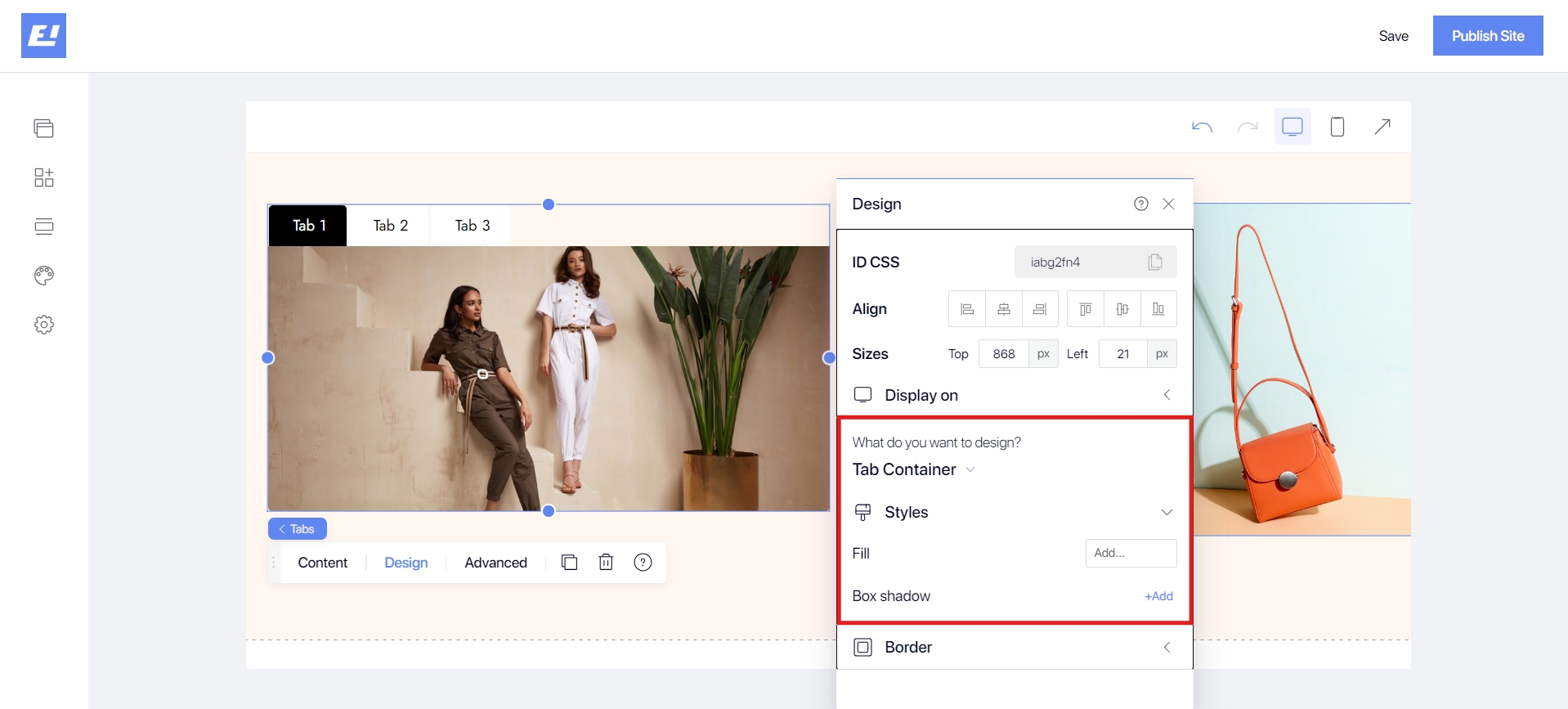
Tab Container:
The Tab Container is the area surrounding the tabs and typically contains the entire tab navigation interface. Designing this section includes customizing properties such as background color, shadow, and border. Use Styles to customize the basic styles for the outer frame of the tab container. For more information, see Styles.
Tabs:
Tabs are where users can select different tabs. Each tab can be customized for its normal state, hover state, and selected state. Use Styles to customize the overall appearance of the tabs. For more information, see Styles.
+ Regular:
Icon: If the tab contains an icon, you can customize how that icon is displayed.
Fill: Background color for the tab in its normal state.
Box Shadow: The Box Shadow option allows you to create a shadow effect for elements, making them stand out and appear more three-dimensional. You can customize the type of shadow, position, color, opacity, and size of the shadow.
Direction (Determines the orientation of the tabs): Horizontal (Tabs are arranged horizontally) or Vertical (Tabs are arranged vertically)
Fitted: Tab sizes fit the content or its container.
Spacing Between: Determines the spacing between the tabs. Drag to set the desired spacing.
+ Hover:
Fill: Background color of the tab when the user hovers over it.
Box Shadow: The Box Shadow option allows you to create a shadow effect for elements, making them stand out and appear more three-dimensional. You can customize the type of shadow, position, color, opacity, and size of the shadow.
+ Selected:
Icon: The icon can change when the tab is selected.
Fill: Background color of the tab when it is selected.
Box Shadow: The Box Shadow option allows you to create a shadow effect for elements, making them stand out and appear more three-dimensional. You can customize the type of shadow, position, color, opacity, and size of the shadow.
Containers:
Containers are where the content of each tab is displayed after being selected. Use Styles to customize the overall appearance of the tab body. Use Styles to customize the overall appearance of the tabs. For more information, see Styles.
Border: allows you to add and customize the border around the Tabs, and you can also adjust the border radius. For more information, see Border.


