
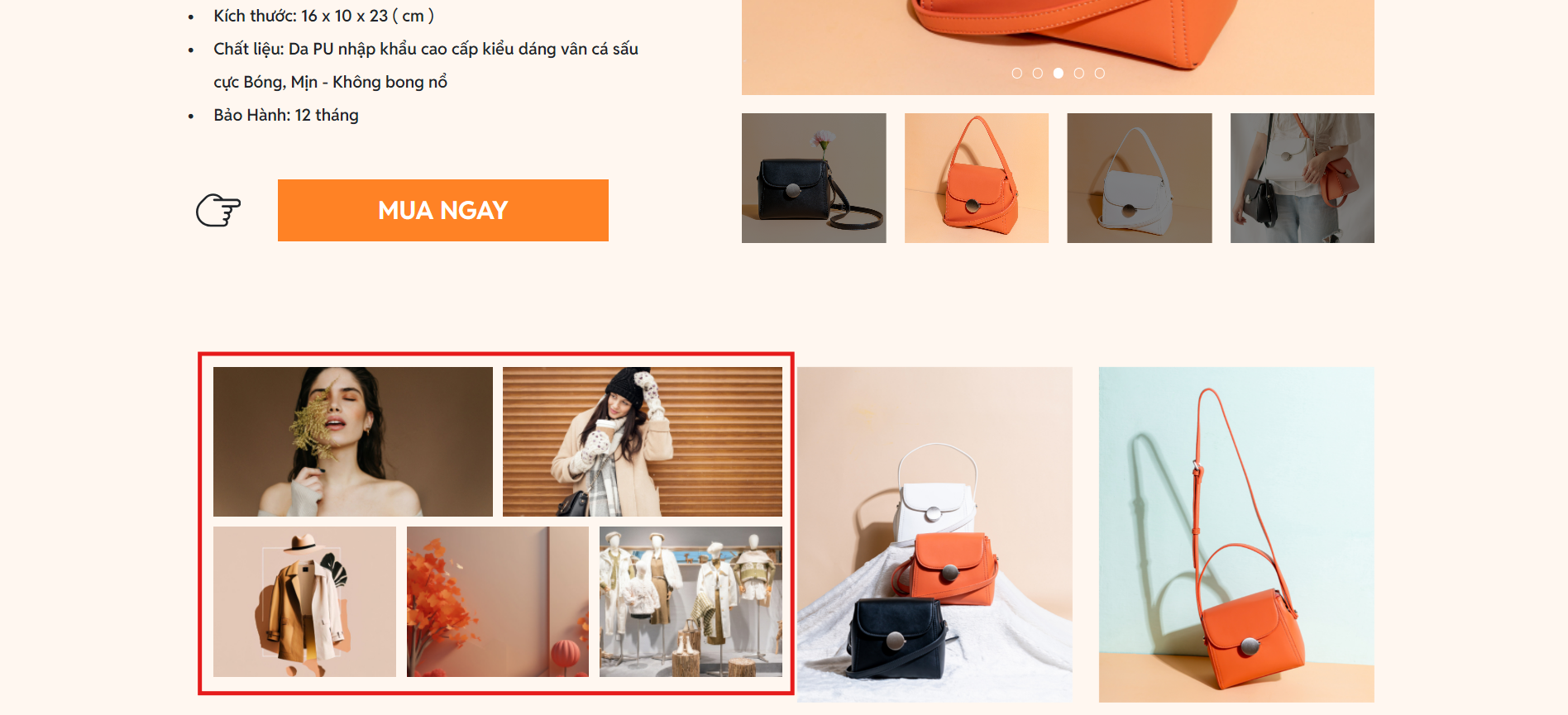
3.3. Gallery
The Gallery widget allows you to display a collection of images in an attractive and organized manner on your landing page. You can use the gallery to showcase product categories, photo collections, or images related to the services you offer.
1. Add Gallery to the landing page
Click on Widgets in the sidebar of the editor.
Select Gallery from the Media section.
Choose the Gallery element and drag it onto your landing page

2. Gallery Editor
2.1. Content Editor
To access the Content Editor, click on the Gallery widget you wish to modify on the screen and select Content from the quick settings bar. Here, you can add or replace images to suit your landing page.

2.2. Design Editor
To access the Design Editor, click on the Gallery widget you wish to modify on the screen and select Design from the quick settings bar.

Align: Helps you align the Gallery within the container, see details here.
Sizes: In the design editor, allows you to adjust the size and position of elements on the landing page, see details here.
Display on: Allows you to control the display of the Gallery on different devices, including Desktop and Mobile.
Styles: Allows you to change the background color and shadow effects of the selected Gallery, see details here.
Border: Allows you to add and customize the border around the Gallery, and you can also adjust the border radius, see details here.
Gallery layout: Configure general settings for the gallery, including how images are displayed, the number of columns, spacing between images, and other related options.
Grid: A way to organize content in a grid format, helping to arrange elements (such as images, text, or widgets) neatly and manageably.

Masonry: A type of grid layout that allows elements (such as images) to be arranged unevenly to optimize space and create a visually appealing interface.

2.3. Advanced Editor
To access the Advanced Editor, click on the Gallery you wish to modify on the screen and select Advanced from the quick settings bar.

Animation: Allows you to add dynamic animations to the widget on your landing page to make it more attractive and lively, see details here.
Desktop/Mobile sync design: Allows you to set synchronization options for the design between desktop and mobile, see details here.
Position type: Lets you choose the appropriate positioning style to optimize the webpage and provide the best experience for users, see details here.
Custom advance: Allows you to customize the appearance and behavior of the component using CSS layers and custom CSS code, see details here.
Last updated